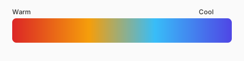
Temperature in UI
Cool gray-blues feel clinical and calm; warm off-whites feel friendly. Dark mode often shifts neutrals slightly blue or slightly bronze — pick one story.
Mixing temperatures
A cool page with a warm CTA draws the eye. Seasonal campaigns flip the balance — autumn layouts stack warm rusts; winter layouts favor cool ice tones.
Photography and overlays
Hero images with warm skin tones often need cool UI chrome so text stays readable. Gradient overlays should move lightness more than hue—otherwise faces turn unnatural.
Dark mode temperature
Cool dark grays (#0F172A family) feel technical; warm charcoals feel editorial. Pick one temperature story for dark theme and keep accent hues consistent with light mode so brand recognition survives the switch.
Seasonal campaigns
Retail sites rotate warm/cool campaigns quarterly. Encode seasonal palettes as optional token sets rather than replacing core neutrals, so engineers can toggle themes without refactoring components.