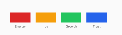
Emotion and association
Warm hues (red, orange, yellow) tend to feel energetic; cool hues (blue, green, violet) feel calmer. Saturation amplifies intensity — neon green shouts; sage whispers.
Industry patterns
Finance and healthcare lean on blues; food brands use appetizing reds and yellows; luxury often uses black, gold, or deep neutrals. Your audience may break the pattern.
- Trust / stability: navy, slate blue
- Growth / wellness: green, teal
- Premium: black, champagne gold, deep burgundy
- Playful: coral, bright yellow, saturated purple
Test with real users
Run quick preference tests and accessibility checks. Psychology guides direction; contrast ratios and legibility decide what ships.
Culture and context change meaning
White can signal purity in one market and mourning in another. Red means sale in retail but danger in industrial UI. Document the audience for each product surface and test copy plus color together in usability sessions.
Saturation as volume control
Low-saturation palettes feel premium and calm; high-saturation palettes feel youthful and urgent. If everything is neon, nothing wins attention—reserve the loudest chroma for one CTA or alert at a time.
Pair psychology with measurement
Hypotheses about “trust blue” should still pass WCAG. After you pick emotional direction, run text and icon pairs through the contrast checker and color-blindness simulator so the feeling you intend is the experience every user gets.