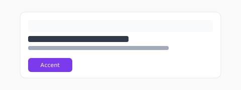
Layers of a UI palette
Background, elevated surface, border, primary text, muted text, brand accent, and focus ring — each needs a documented token and dark-mode counterpart.
Modern CSS color
Prefer oklch() or hsl() for ramps; use color-mix() for hover states. Wide-gamut displays may need P3 fallbacks for brand-critical hues.
- :root custom properties for themes
- prefers-color-scheme for auto dark
- Forced-colors / high-contrast media queries
States and feedback
Hover, active, disabled, and invalid states should shift lightness before hue. Keep error red distinct from brand red.
Focus and interaction
Focus rings should be visible on every interactive control, not only links. Use a dedicated token with sufficient contrast against both default and hover backgrounds, and test with keyboard-only navigation.
Gradients and mesh backgrounds
Fashion sites love multi-stop gradients; SaaS dashboards often need flat surfaces. When you use gradients behind text, place a scrim or solid panel so contrast ratios remain predictable.
Shipping modern CSS color
OKLCH ramps reduce yellow mud when stepping lightness. You can still ship HEX fallbacks: generate OKLCH in design, export HEX comments for older pipelines, and verify in browsers your audience actually uses.