Common types
Protanopia and deuteranopia reduce red–green discrimination; tritanopia affects blue–yellow. Monochromacy is rare. Simulators approximate, they do not replace user testing.
Design tactics
Combine color with shape, position, labels, and texture. In charts, label series directly instead of relying on a color-only legend.
- Use patterns or icons in status badges
- Underline links — not color alone
- Test with grayscale and simulators
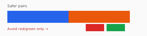
- Avoid red/green as the only diff in charts
Accessible palettes
Blue–orange and purple–gold pairs survive most deficiencies better than red–green. Verify contrast for everyone after picking accessible hues.
Testing with real users
Simulators in browsers and design tools are educational. They do not cover every variant or severity. Include participants with color vision deficiencies in usability tests when color carries meaning.
Status and alerts
Success and error states should pair color with icons and text (“Saved”, “Payment failed”). Never use red versus green as the only difference between destructive and safe actions.
Maps and heatmaps
Sequential palettes should vary in lightness, not only hue. Diverging palettes need a clear midpoint and labels. Offer a table view alternative for critical analytics.